ShopDreamUp AI ArtDreamUp

Deviation Actions


Description
Image size
2607x3780px 4.11 MB
Make
NIKON CORPORATION
Model
NIKON D90
Shutter Speed
10/300 second
Aperture
F/5.3
Focal Length
62 mm
ISO Speed
1600
Date Taken
Jan 20, 2010, 5:39:19 PM
Comments120
Join the community to add your comment. Already a deviant? Log In
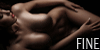
Oh my God, this is going to be so hard to critique! Mainly because I know you have your own style and for all I know you could have intended it to turn out like this. Anatomy-wise this looks great and I love how you used pastels to create that rough texture to the body. I also like the use of grey in there – I would have never dared touched it. The dark space she is facing intrigues me a little – looks like she is looking into a chasm a bit and it creates a wonderful contrast that makes her stand out more.
This entire piece has a rough sketch look that suits it wonderfully. I do notice that the foreground in particular has a less detailed look and you can particularly see the lines… But as stated, it could be all part of the rough-ready look this piece has. My apologies for not giving the best critique <img src="e.deviantart.net/emoticons/let…" width="15" height="15" alt="